I have settled on the outcome for this project being multiples of ink drawings on paper squares impregnated with burnt milk. This will be a fantasy family photograph album represented as a ‘shrine’ to the past but one in which the imposed narrative has been interrupted. The key to success will be to show this conflict of interpretation through subtle irony and humour, parred back so as to give ample room for interpretation. The nature of both the installation and drawings will determine success so both of these are considered here.
Installation options
Having been inspired by Boltanski, Kabakov and others, the importance of the installation was highlighted, so a number of alternative arrangements for an installation were sketched and we discuss the merits of each below.
A key element of the installation was my decision to have the drawings connected together in some way. I wanted to create a network of memories that had ‘neural’ pathways between them rather than being individual objects. This was a very important decision – memories are linked in long term storage and they influence each other, one memory can trigger another and some pathways are stronger than others. I have chosen wire to connect the drawings together (in some way) so each of the installation options below takes this into account.
Hole in the roof
An idea from early in the project was to create an enclosed installation with objects breaking through the roof and being lit from above, casting light down into the space. My thinking was to create a ‘pierced’ room that had been infiltrated by a new version of the truth. The walls of the space would contain the gospel of the family album, but those hanging in space would question the imposed narrative. The light coming from above be spiritual, a higher force so we would turn the enemy into a new saviour.
I enjoy how this installation turns the horror of the space into a shrine and provides an escape route through the roof to a new reality. Practically however, it would be challenging to hang the drawings so they were all viewable at close quarters as we would have to make use of vertical space to make them all separate entities. The detail of the drawings can only be seen at close quarters so we may lose that impact. This may lead to frustration on the part of the viewer and limit their interest.


Image backdrop
This option would involve hanging the ink drawings in front of a single large image or projection. Inspiration came from the work of Daniel Rozin (and others) who project large images and video on silk screens. These ghostly apparitions are incredibly effective how they suspend visuals in space, particularly when video is used – the surreal visuals are an attention grabber. In our case, the images on the silk screen would potentially be animated family photographs – a blurry and ethereal memory of the past that sits in the background. The suspended drawings then question this faded set of memories.
I would very much enjoy creating a multimedia installation including an animated family history as I think this would be a powerful and contemporary shrine. I also enjoy how the family album in the background would be large and looming but faint at the same time – dominant in one sense but lacking power in another. However, practicalities make this design quite difficult as a dark space and projector would be required. Also the darkness of the space would once again make the ink drawings hard to interpret, unless they were increased in size.

Church window
The church window brings in a religious reference, and would create a fairly obvious shrine in which to display the drawings. Stained glass scenes tell a biblical story – so the unquestionable truth of those stories are being compared to the truth of our own family story. We are introducing the conundrum of religious truth here – can we question the validity of bible stories in the same way that we question our own family history?
I enjoy how the church is the centre of a village, the bells ring to warn of danger and it is a place of sanctuary, but the fact remains that it was also bombed during blitz! My challenge with this idea is that we have removed geographical reference point – the link to the house and the shop added a distinct element of time passing, of an incident occurring at a specific location that has been bulldozed out of history. New memories have, and will continue to be formed on that very spot where the house stood. I feel that the sense of location is very important in this piece hence I don’t believe this option is as potent as others.

Under stairs
Another early consideration was to create an under stairs cupboard for the installation, as this replicates the cramped space in which the family hid overnight. This is a similar option to the hole in the roof, but the light was to be projected through a slatted sloping wall at the back of the space. The thinking with this would be to create a small, cramped space that could only fit a single person. We are trying to create claustrophobia in the viewer and give them a powerful feeling of the past event.
As for other options, I think that lighting may be an issue with this idea. A small dark space would make it challenging to light the drawings and having them at different vertical heights would be frustrating and cause physical discomfort for an audience.

Supermarket shelf
The village shop that sits on the site of the original house provided inspiration to use milk in the drawings as a contemporary reference and geographical landing point. So the idea with this installation would be to create a set of orderly virtual shelves. This introduces plenty of ways to interrupt the drawings with artefacts from the shop, for example, product drawings, price tags, out of stock signs and simply blank drawings.
For me this is the most intriguing option as it allows us to interrupt history with modern artefacts. I also enjoy how we have commoditised memories and given them a value. Some memories are more desirable than others and over time products are replaced with new stock just as memories get overwritten with ‘new improved’ versions. We could even think of our memories being ‘marketed’ to us by our elders.
Product placement also comes into play with this arrangement. Arrangement of the drawings as a set will be critical, i.e. will they be in a linked sequence, pairs or groups. Does a separate narrative exist in each set, i.e. a short story within the big story? Also, how far apart the drawings are will define how the narrative carries between them. These are all things to be evaluated.
Overall, the physicality and geography of the shop resonates strongly – the undiscovered bomb in the ground is another key to the whole story and it’s why it is constantly retold. Therefore I feel strongly that I need to integrate the shop in some way as part of the installation. An installation along these lines will be pursued.

Ink drawings
24 ink drawings were created to provide enough of a set to consider how multiples would look as a set. Each drawing was punched in readiness for hanging and the brush strokes of the applied milk were positioned at the bottom of the paper for consistency.
The drawings below vary in their degree of success. The most successful are those where some definition can be seen in the faces or key action is taking place. Those in close up give a sense of character – a smile, a sideways glance, a grimace or an awkwardness in front of camera. I believe these will resonate with the viewer – though remembering our previous thinking, we don’t want to provide too much facial definition as we want the viewer to add their own history by inserting their own ancestry.
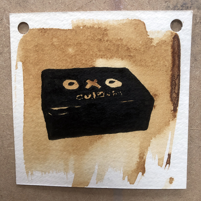
Several drawings of objects or actions were also made. I thought it important to include the bombed house in some form but in reality this has little visual appeal as it stands – a different view or a pairing with another drawing may be useful. The OXO tin was included as a reference to a retro shop product and I like how it interrupts the narrative – daily life was proceeding despite the trauma all around. The men working on a threshing machine works well I think. I like how this drawing demands a detailed look to understand what type of machine it is – a tank or a farming machine?
The style is working well. I purposefully included drawings at all ends of the life spectrum, young and old, and tried to represent a diverse mix of groups and activities. Village life goes on as normal, with a single reference of a young man in uniform going off to fight in the war. To enhance this we will further explore the family album to embrace a more diverse set of memories. What is clear is that this set creates a rosy memory of life in the war – the family album contains a single image of the bombed house so this is a fairly literal interpretation.


So the family album is now ripe for interruption. Below are some manufactured drawings to attempt this. As above, I believe some work better than others. The action shots – hand on siren, Luftwaffe expletive and pot shot at a Stuka stand on their own and have good narrative. Why is this? These are all the cheeky actions of a child and have inherent humour. The bomb through the roof and juggling seem to lack the ‘cheek’ of the others and push back less against the rigidness of the imposed narrative.
Peer review confirmed my thoughts. The cheek of the child is what we need more of so further ideas will be developed. A final consideration is whether to pair up the drawings, i.e. family album image paired with interruption. We did discuss this in a previous post and decided that a methodical pairing would be too rigid and ‘false’. However, the linking of narrative is too useful to be ignored so the flow of the narrative across the set should ebb and flow like a children’s adventure story possibly. How we end this story is the last consideration. Who is the winner and what do we leave the viewer begging to know?


Next steps
The installation idea of a shop interior will be considered further and then resourced in terms of size, materials and lighting.
The ink drawings will be continued with, based on the evaluation above. We will aim for a diverse mix of truth and interruption.
Another consideration will be how many drawings to create. I believe we need enough to engage a viewer but not so many as to overwhelm them. Peer input and research on this will be carried out.