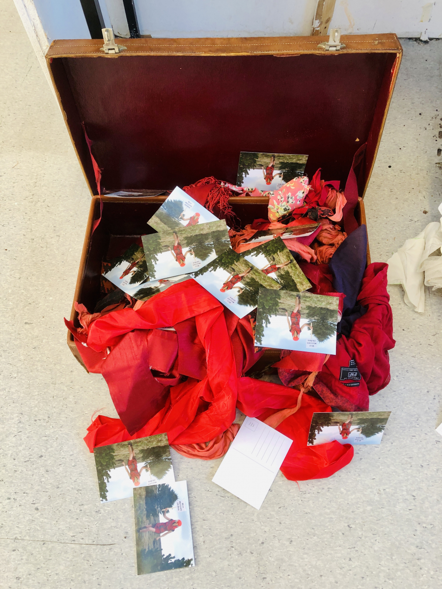
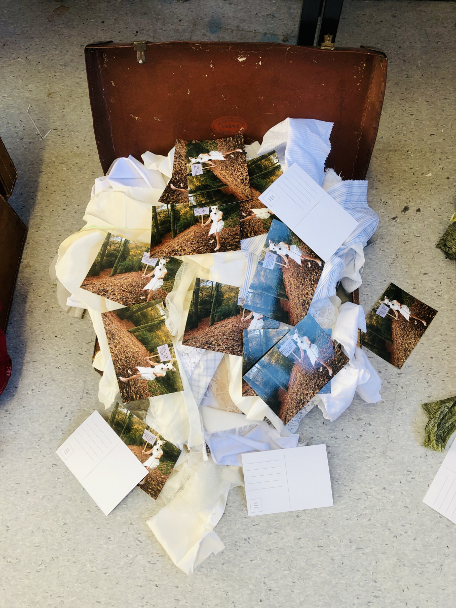
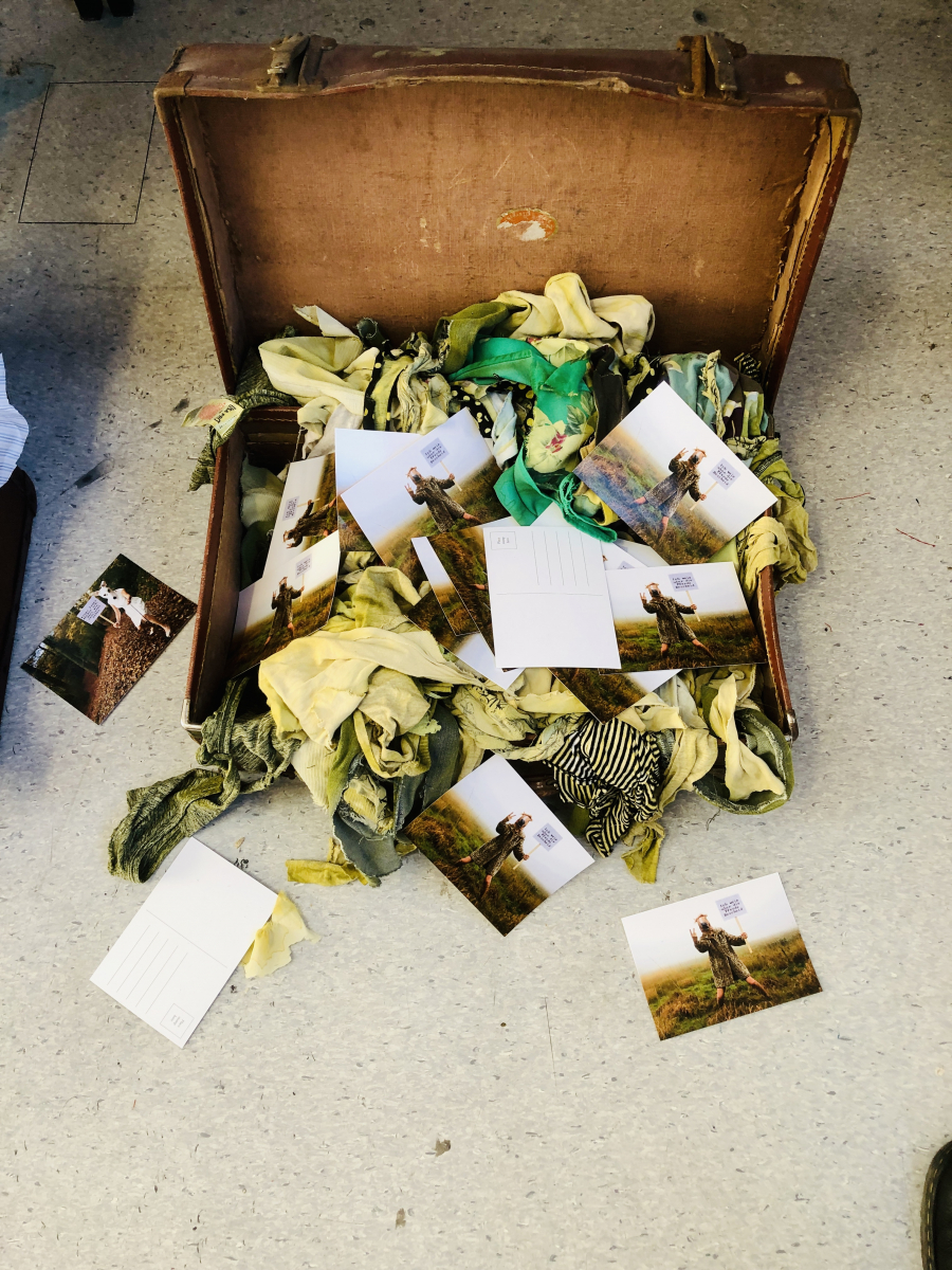
That point in a project when you bring all elements together for the first time is always exciting. For this mockup I brought together three antique suitcases, the three sets of postcards and a batch of material for each suitcase that mirrored the clothing worn in each of the images. The postcards were scattered randomly in each of the cases ensuring that both sides of the cards were shown.
My first impression is that the cases work well as a set and the three have a natural balance. The material colours are a good differentiator and the eye is drawn from each material colour to the dress colour in each of the postcards. I like how when I find that connection in one case I then pan across the others to make similar connections. Once I’ve made that connection I then look in more detail at each of the postcards. I see what seems to be the same character but dressed differently, in a different location and protesting a different message.
Out of the blue I’ve just seen another unanticipated connection between the colours I’ve used and the language on the placards:
- Red – denotes the anger contained in the phrase “We need to talk”
- White – reflects the innocence of saying “One day I’d like us to go for a walk”
- Green – sums up the envy in saying “I know about the horses”
These connections are a lesson in sometimes just letting go of meaning to see how things resolve. I made subconscious decisions about what clothing to match with each phrase but somehow a fusing of meaning has developed on its own. That is fascinating: does it show that deeper parts of my self are at work here? This is a very important lesson as I can be guilty of over-analysing potential meaning before experimentation.
The material itself was ripped into consistently sized strips for continuity which was a replacement for the neatly placed clothing I’d tried earlier. I make the point that these are cases of conversations that have been reopened after a period of latency but then stirred around. This mirrors the language which has also been ripped apart over time via translation, reinterpretation or simple forgetfulness. There is a violence to the ripped clothing which adds a shock value – are we seeing the clothing in the images ripped up? When we see the state of the material we understand there is no going back, a decision has been made and we are moving to the future with a resolution.
Then we have the blank postcards. I considered writing on the cards, or even issuing them to third parties to add their responses. However, blank cards strongly suggest that communication has ended, or it was always one way and never received a response. The German language further highlights that the words were probably never understood in the first place. Or are we saying that someone is still waiting for a response or explanation? Yes, this is getting very close to how things stand, so repeated attempts at understanding this history but still no plausible answers have been supplied. I’m quite happy with how that comes across.
Below we see the three cases in a single image as a study in how we could potentially separate the cases in an exhibition setting. This level of separation works on several levels, the spilling out of clothing reaches its tentacles to the other cases but with no physical connection. These are different events in history and a separation is necessary but we must be sure that a viewer can link them together in their mind.


Summary & next steps
From an objective perspective I see an intent in the artist making this arrangement a work of art. Initially I was not convinced about the ripped clothing as I thought it would look unresolved and would render the scattered cards less distinct. However, my discussion above has convinced me that this has far more meaning than a neatly arranged set of clothing. There is frustration and resolution in these memories that can only be represented in this way.
This studio mock up clearly lacked the finesse of an exhibition space. But lock down 3 has curtailed any prospect of a formal exhibition hence I can only hypothesise on how my final piece would look in a suitable space. A small plinth for each suitcase would give them salience which I believe would elevate their significance – I am proud of how these things have been dealt with and that needs to be highlighted. Also raising the cases off the ground would make the text on the cards easier to see and read for the viewer. Studying the context of each image is important as I think even with no knowledge of German, a viewer would enjoy constructing their own narrative.