Statement
Richard Hyde
It was quite a noisy night, 2020
Ink and milk on paper
Traumatic experiences impact the human brain in complex ways and psychology informs us that these memories are stored as smaller chunks rather than entire events. This may be nature’s way of protecting us against reliving a disturbing past but does it also introduce the potential of adding fiction to the retelling of these faceted stories?
In this piece, I have investigated a traumatic wartime story from my own family that has passed down several generations and transformed along its journey to gain an almost mythical status. The fascination is in how a child and adult deal with a traumatic event differently by interjecting their own imagery and symbolic connections to lay down memories in a way that gives them closure.
The shrine-like installations of Christian Boltanski and Ilya Kabakov provided inspiration, particularly in how they skilfully blur truth and fiction and give the viewer a quiet space to recount and insert their own ancestral past.
The work itself disrupts the sacred family history and we are asked to consider how shattered memories and contemporary influences can morph how we perceive the past.
Final outcome
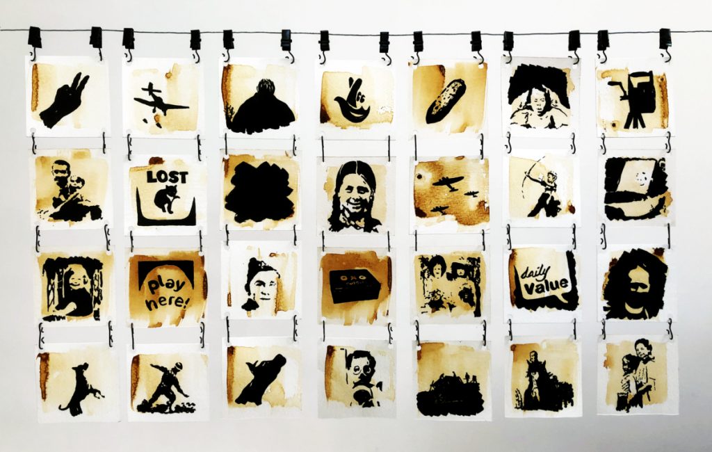
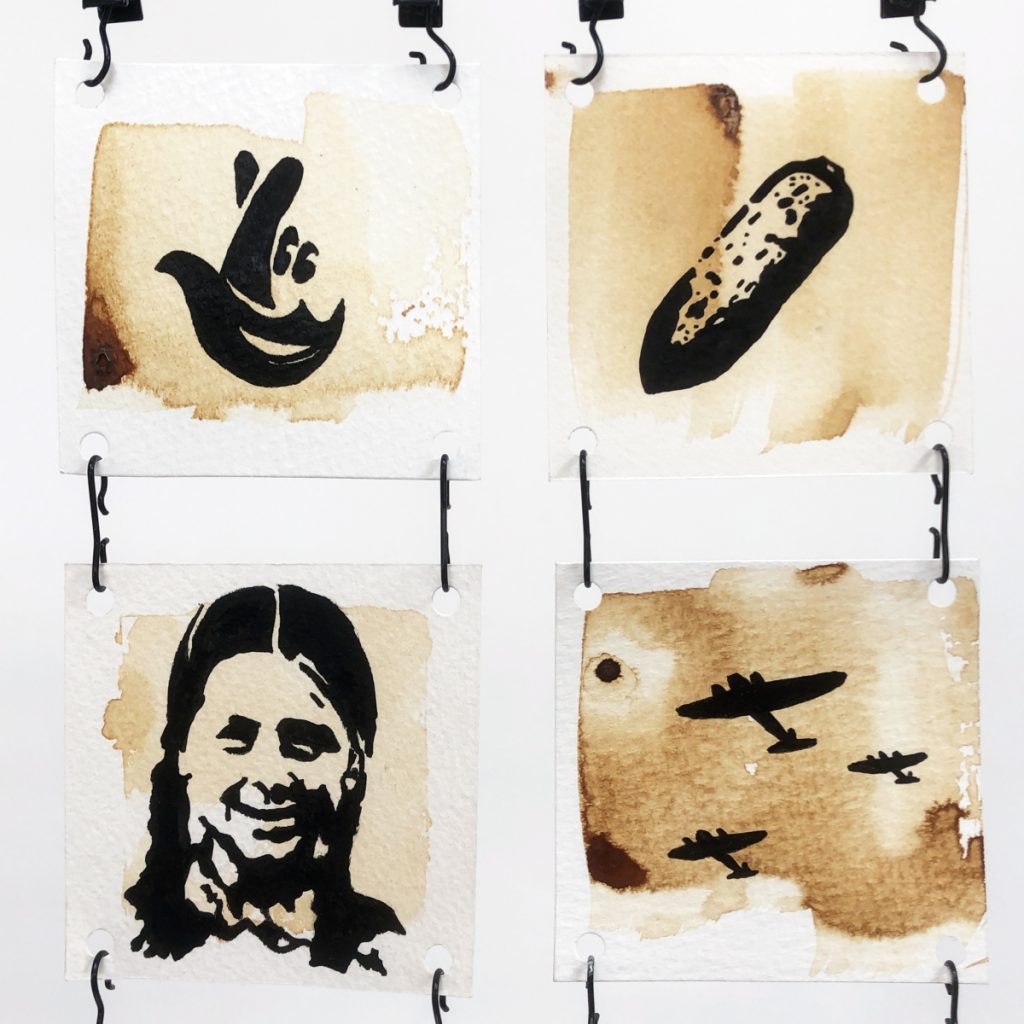
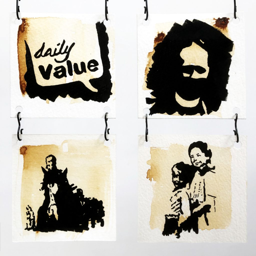
We see a horizontal wire with 7 columns of black ink drawings suspended from it with black clips against a white background. The 28 drawings are made on small squares of thick paper and are closely spaced. Each drawing has a brown background that appears to have been loosely brushed on and this covers just the central area of the paper leaving a border around the edge. All the ink drawings are different and they are a mix of people, village life, artefacts of war, and more contemporary objects. We can see some detail and personality in the faces of the people but the dark black ink leaves much to interpretation. We get a sense of a traumatic experience that has been interjected with unusual and forgotten memories. The drawings are not thematically connected but we get a sense that there are hidden links between them as our eyes dart across the arrangement and create narratives.
Starting point
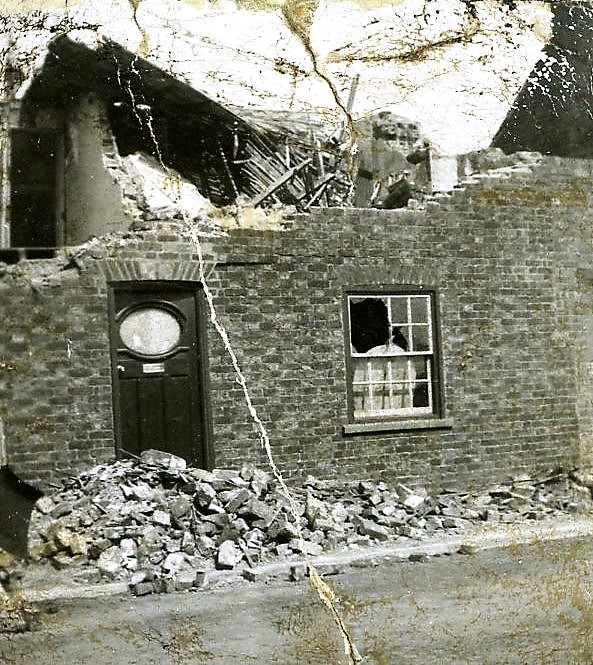
I took a significant family event that happened on the night of March 19th 1941 as my starting point. On that night my mother (aged 3) was living in a small village called Hutton Cranswick in East Yorkshire with her parents and younger brother. A German air raid took place and a deep penetration bomb came through the house but didn’t explode. The bomb was never found. The family escaped unharmed but my uncle was diagnosed with trauma-induced deafness and has been deaf ever since. My mother cites this event as having a profound influence on her throughout her life.
Research & references
Primary research involved a visit to the village with my mother where we visited several locations to get a sense of the geography of the place and to talk to people who may have had stories to tell. We luckily found Max Thompson (aged 93) who was 13 at the time and we recorded an interview with him. A key phrase he came out with became the title for the project:
“It was quite a noisy night.”
Max Thompson
Newspaper archives and web articles about the bombing of East Yorkshire were collected as secondary research and we found other accounts of the blitz that informed our creative development.
A full list of references used is on a separate blog post.
Concept
Traumatic experiences impact the human brain in complex ways and psychology informs us that these memories are stored as smaller chunks rather than entire events. This may be nature’s way of protecting us against reliving a disturbing past but does it also introduce the potential of adding fiction to the retelling of these faceted stories?
In this project, I have studied a traumatic wartime story from my own family that has passed down several generations and transformed along its journey to gain a mythical status. My fascination is in how the child and adult interpret a traumatic event differently by interjecting their own imagery and symbolic connections to lay down memories that can be told with their personal voice.
I aimed to disrupt a sacred family history by asking us to consider how shattered memories and contemporary influences can morph how we perceive the past.
Materials
Powdered charcoal was used as a drawing material early in the project to explore expressive mark making in response to recorded interviews.
Papermaking equipment was purchased and paper made using pulped newspapers, again as a reference to material that exists in the modern-day newsagents but also as it represented how the event has been reported on over the years. This extended to the use of papier-mâché to create various sculpted forms.
Wire and grass were used later in an experiment to create a large sculpted hand.
In the final outcome, milk was used for mark making and it was burnt onto watercolour paper as it represented a contemporary reference to the modern-day Spar shop. This was combined with black Indian ink as a drawing medium.
Health and safety
There were no major health and safety concerns throughout the project. All materials were safe to use in college or home studio and I took the normal safety steps using cutting knives.
Artist inspiration
During initial research, the Memory Illusion by Julia Shaw was read to help understand the psychology of traumatic experiences and how they are stored as broken memories which may be a mechanism the brain uses to prevent complete recollection of the event.
The drawing work of Matej Frank who uses his own body as a drawing tool was studied early in the project when I was trying to reinterpret audio recordings as drawings.
The performance work of Marina Abramovic was studied as she has been consistently inspired by her traumatic past. Her quote “When we are traumatised we leave our bodies” provided creative inspiration.
The liquid charcoal drawings of Felix Dolah were a great inspiration in the search for a suitable drawing style. His elongated figures and dripping canvases helped loosen up my style.
A significant breakthrough was the discovery of Christian Boltanski. His installations are based on his own family history and wartime trauma. They feel like a cross between a museum and a sanctuary to the dead. The lighting and multiples he uses were particularly inspiring.
Links between Boltanski and Ilya Kabakov were then made. Kabakov engages with childhood and early youth in his extravagant fantastical installations. I enjoyed his thought that “Art was not necessarily made with today’s viewer and social context in mind”. This helped me add contemporary references to the outcome.
Kaari Upson created a whole series of work based on the belongings of a man she had never met. The fantasy and absurdity of her work opened doors to a more abstract interpretation in my own experiments.
I studied artists who interrupt the museum, including Antony Gormley and Chris Dorsett. This led to a study of Matt Smith as well who coated the truth of a museum with subversion. These artists inspired me to move to the idea of interrupting the family photograph album.
When I was investigating potential installations Gregory Crewdson was studied for his staged retro photography, though his sets are extremely elaborate they gave insights into how to engage a viewer.
Papier-mâché artists such as Claes Oldenburg, Nicole et Aude, James Morrison and Vally Nomidou were studied when I was using paper as a structural material. These artists took paper art to the level of fine art and helped me evaluate it as a potential material.
A deeper look at deconstruction as an artistic strategy involved a look at the work of Michael Landy, Paul Cristina and Pierre Huyghe. Huyghe, in particular, gave me the thought that using memory in art gives the past back its possibility if not its truth. The idea of twisting the past into something new became a real possibility.
When I was creating the initial cartoon drawings I investigated the meaning of humour in art and I studied the research of Simon Critchley which helped me appreciate how and why humour works.
I finally moved in the direction of ink drawings and looked back at the work of Otto Dix to study his style and subversive skill in putting deep meaning into simple drawings.
Development
The initial development stages were documented in a sketchbook and have been scanned in a blog post. Following the Covid19 lock down all development has been documented as individual blog posts. A synopsis of all development stages is documented below.
The first experiments were loose charcoal drawings where I was trying respond physically to recorded interviews. The idea of converting the digital to analogue is a recurring them in my work but in this case the result lacked any finesse but was considered as a potential backdrop to other work.
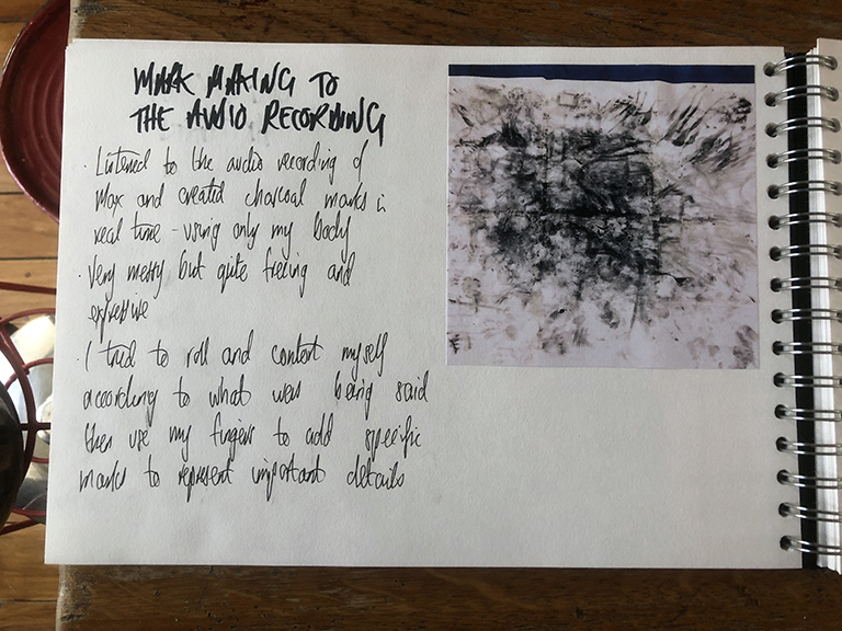
Thinking of the modern day Spar shop inspired me to try mark making with domestic materials. Drawing with milk and burning it in the oven proved instantly successful both visually and as a symbolic reference to the scorched remains of the bombed house. This was parked as an idea as other options were pursued.

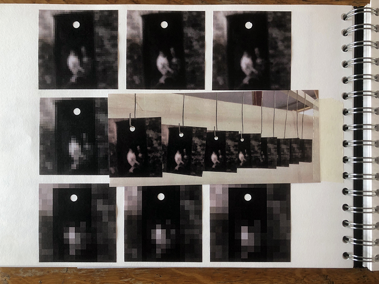
Exploring memory in a digital form led to various experiments with blurring photographs. This was an attempt to hint at fading memories which did create some good references to historical photographic plates but I didn’t feel there was enough disruption of history occurring so it was not pursued.
Back with milk drawing, different food stuffs were tried but milk was most successful in terms of tone and drawing ability. The burnt sienna colour of the milk had a earthy quality of faded time that was always appealing and it could also represent the fading of a house interior, or the ‘fagmolia’ of the village pub.

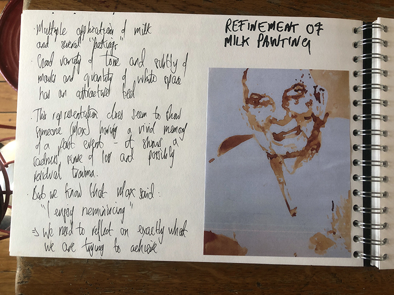
Drawing with milk was challenging but multiple layers allowed tone to be built up. The larger drawings were successful but I found smaller ones more challenging in terms of definition. This got me to consider the scale of the eventual drawings – if smaller ones were required could milk be used in some other way, maybe as a backdrop?

I started to explore contemporary references to add to the milk drawing mix. The grid reference of where the bomb hit was a timeless element that added an unquestionable truth but I questioned whether it was turning the work into a museum piece – a balance I was very cautious to monitor.

Refinement of the milk drawing style involved building up layers of milk over several sessions. This did add tone but clarity was a little lost so I was still considering how else the milk could be used.
The interjection of humour had always been on my mind hence I created some postcards written in the present day but about the historical event. The modern-day interpretation of history was ripe for comedy in comparing a simple village life to modern-day materialism but it really ended there so this idea was dismissed. However, more subtle humour was considered.

Inspired by Ilya Kabakov I sketched out a potential installation that included a hanging space for the drawings. I had the drawings puncturing the space from a broken ceiling as if disrupting the orderly family environment.
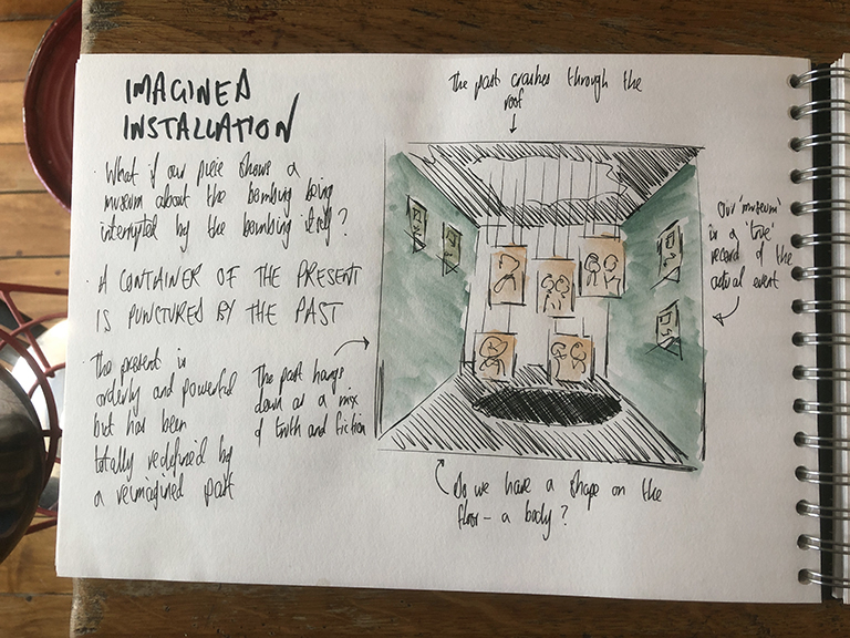
To study potential lighting I constructed a scale model of the above installation. The idea of this being an under stairs cupboard that felt cramped and dark was becoming powerful but I was still considering whether this was too literal an interpretation.

It was at this point that the Covid19 lockdown occurred hence the idea of a large installation became challenging. I went back to look at materials once again to try to find an equally powerful way to show the interruption of a space.
Newspaper as a structural material had many contextual links so I began making multiples of objects such as incendiary devices – thousands of which had been dropped during the night of bombing. Coating these objects with contemporary references was experimented with but we were once again venturing too close to the museum construct so this idea was abandoned.

I hit on the idea of making my own paper and using that for the milk drawings so I spent some time making paper from pulp. The paper itself was successfully made but it was far too rough to show the detail of milk drawings hence it was also abandoned.

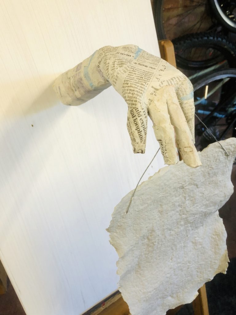
A final experiment with paper involved the creation of human papier-mâché forms. I was trying to add back in an emotional context and again the paper forms could be encrusted with narrative to build a deep picture of the impact of the trauma. I explored whether hands could be used to hold a set of drawings and this quite macabre idea had potential – as if the past was trying to be heard and tell its story. But I decided that I wanted more of a ‘family album’ to be the object of disruption hence I moved on.
Following the paper experiments, the idea of the Cranswick shroud was created following inspiration gained from Ilya Kabakov. Pulling in a religious link was intentional as another set of truths that have stood the test of time but are open for questioning. I enjoyed this level of surrealist fantasy but I struggled to consider how to add deep meaning to the drawing if it was to be limited to show a single human form. Hence I moved on once again.

Given the lockdown situation, I had new materials at hand to attempt a sculpture at scale. So I created a large hand sculpture filled with moss, the natural material was linking to the rural geography of the village. The clear child hand at scale was imposing, particularly as it seemed to be clawing at the skies seeking freedom. But I was continually pulled back to the drawings and how to integrate them hence it seemed an unlikely combination to make work so sculpture did not seem the right direction.

In parallel to the above sculpture, I was looking at the potential of a cartoon strip and the use of humour in art. I have always appreciated the use of humour in my art, and believe it has an important role to play in how children deal with trauma. This direction had immediate appeal so a style and depth of humour was pursued.

The big breakthrough was when I applied ink on top of watercolour paper brushed with burnt milk. The contrast and style of drawing seemed to pop out of the page hence I felt I had hit on a style to pursue.

I set to work creating digital mock-ups of a set of ink drawings which were a mix of actual family photographs and fictitious drawings that would create intrigue in a mixed situation.
At the same time, I decided on using a small drawing size (8 cm square) to reference the size of a historical black and white photograph.
The next stage was to consider installation styles for this new idea of multiple small drawings. A pseudo-supermarket shelf was chosen from many alternatives as it linked to the Spar shop but also allowed the drawings to be close enough together to allow connections to be made.
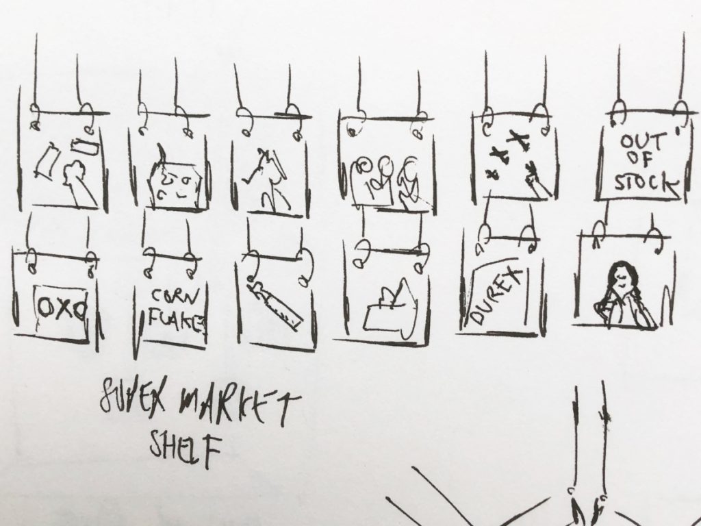
Some contemporary references were added into the drawing mix from ideas gleaned from a modern Spar shop. I enjoyed how these disrupted the intensity of the war story which was my intention so a number of these were incorporated to do exactly that.
Many arrangements of the drawings were considered and each one seemed to offer a different set of connections. My aim in choosing the final arrangement was to give the viewer an entrance and exit point from the set. The layout below was chosen as it did just that and was balanced in terms of the spread of contrast and human figures.
A single blank (scrubbed out) drawing was added after further deliberation to give another indication that this family album had been doctored.
Several background options were considered as well as the hanging style. Below shows the final choices made which were based on simplicity and including nothing to detract from the drawings themselves.

Evaluation
This outcome is the result of much historical research and many experiments. I have moved from complexity to simplicity in a stepped fashion, peeling back the layers of the story to unearth the human condition that sits behind it. It feels like a satisfying journey where some myths have been busted and others have been cheekily introduced. My aim was to present an alternative lens with gestalt characteristics that the view would enjoy playing with.
A concern throughout was steering away from a glorified museum construct as this would have added little and questioned less and I feel this has been achieved well. Several times I discounted elements that were too literal and gave too much away. The artists I studied continuously stated how the blurring of meaning is absolutely key to work that investigates the human condition by inviting the viewer to be a contributor, not just an observer.
The combination of burnt milk and black ink is striking, symbolic and has an historical context. The burnt milk has the scorched appearance of both a past fire or faded wallpaper and the ink is as black as soot and mimics the wartime drawings my grandfather was creating.
The black ink affords some definition but not so a viewer can recognise detail in faces. These are intentionally blurred references to familiar ancestral scenes that might exist in any family. This is my attempt to punctuate the viewer with Roland Barthes’ studium and punctum. The studium is the historical and social context and the punctum is the viewer inserting an image in their own family tree. Most families have long lost wartime memories that I hope to invoke in this way.
The use of multiple drawings in a grid format symbolises the open family album or a set of washing dripping dry on a line. These summarise family values and domesticity in a neatly combined way. The multiple drawings of the single event hint at how the memory has been shattered by trauma and time and has the potential for reassembly in multiple ways.
The mix of family photographs and found contemporary references blend well. I find myself analysing each image to determine its truth and place in history. Beyond that, I attempt to make connections between the drawings. Some are apparent such as the V sign and diving Stuka at the top left but others are more subtle. I particularly enjoy the lottery sign and bomb dropping towards my mother as a youngster. The game of chance being played in 1941 and today are quite different and begin a debate about human values and the notion of freedom. There is also the daily value historically being offered by the parish priest but being replaced by nourishment from cheap supermarket produce.
In summary, I find this outcome very satisfying in terms of the density of information it contains in a sublime and simple form. It challenges history in a respectful but confident way and alludes to how humans deal with deeply traumatic events. It gives some context but pushes the viewer away again before they completely understand everything. That perfectly defines the art that I aim to create.
Future potential
The richness of material discovered on this journey has exposed many avenues for further development. There are artists who spend a lifetime delving into a single topic of personal relevance, often with a spiritual obsession to try and find the ultimate understanding of their place in the world. A lecture from Mik Godley (who has explored his own Anglo-German identity over many years in his project Considering Silesia) has fuelled confidence that my own family story is ripe for further interpretation. So here I explore some ideas on how this project could be extended:
- Scaled up installation – halfway into the project I settled on the idea of a walk-in installation combining the visual styles of Kabakov and Boltanski to create an immersive shrine to the past that allowed the viewer to become a part contributor to the experience. This had to be scaled down due to the Covid19 lockdown but I am still intrigued by the idea of a large scale outcome that turns the photograph album into an overwhelming walkthrough experience. Huge ink drawings scattered around a space that create a labyrinth of pathways and viewpoints would feel like a quiet cathedral for personal reflection. Inviting a viewer into a space rather than them viewing from the outside changes perceptions. When the audience crosses our threshold they are in our ‘home’, their senses are more alert and we have more power over their emotions. An immersive installation would be an exciting enhancement to this project.
- Analogue and digital experience – the rich variety of primary and secondary research I gathered were consolidated into the outcome but many other opportunities emerged along the way. The sound recordings of first-hand experiences were particularly potent and I did create a video that incorporated the audio of Max Thompson. I am continually fascinated by the interplay of the digital and analogue worlds, particularly how analogue art can be informed by a digital source and vice versa. There is real scope with the source material for this project to mix these two worlds and create a fascinating mash-up of historical and modern facts, politics, domesticity and sociological insights.
- Site-specific installation – 19th March 2021 will mark the 80th anniversary of the incident and it has crossed my mind that a site-specific project is an amazing opportunity. The new house on the site where the bomb dropped is owned by the Spar group and is currently empty and used for storage. It would be a significant undertaking and a small art cooperative might be required but initial enquiries may be made to see what could be achieved. We could simply scale up the installation as mentioned above and spread the work around the property to create a walkthrough experience. But most significantly local visitors would add their own memories and stories, possibly some that have never been told. These could be recorded or written down and added to the space. The idea of an exhibition that embraces a community is very enticing.
